# Data Manipulation and Analysis
import pandas as pd  # Data manipulation and analysis
import numpy as np   # Numerical operations

# Data Cleaning
from skimpy import clean_columns  # Cleaning column names

# Date and Time Parsing
from dateutil import parser    # Parsing dates
from datetime import datetime  # Working with date and time

# Data Visualization
from plotnine import (
    ggplot,            # Creating plots
    aes,               # Aesthetic mappings
    theme,             # Customizing plot themes
    geom_point,        # Scatter plots
    scale_y_log10,     # Logarithmic y-axis scaling
    element_text,      # Customizing text elements in themes
    element_blank,     # Creating blank elements
    scale_color_manual,# Manual color scales
    scale_x_datetime,  # Datetime x-axis scaling
    labs,              # Plot labels
    theme_void,        # Void theme
    geom_segment,      # Drawing segments
    arrow,             # Adding arrows to segments
    annotate           # Adding annotations
)

# Axis Breaks and Formatting
from mizani.breaks import breaks_log  # Logarithmic axis breaks

# Font Management for Plots
import matplotlib.font_manager as font_manager  # Managing fonts in matplotlib (under the hood of plotnine)

# Paths to the fonts within the working directory
playfair_path = 'fonts/Playfair_Display/PlayfairDisplay-VariableFont_wght.ttf'
lato_path = 'fonts/Lato/Lato-Regular.ttf'

# Add Playfair Display and Lato fonts to matplotlib's font manager
font_manager.fontManager.addfont(playfair_path)
font_manager.fontManager.addfont(lato_path)Reproducing Rise of AI over 8 decades plot
Python
DataViz
AI
Our World in Data
#2024plotnineContest
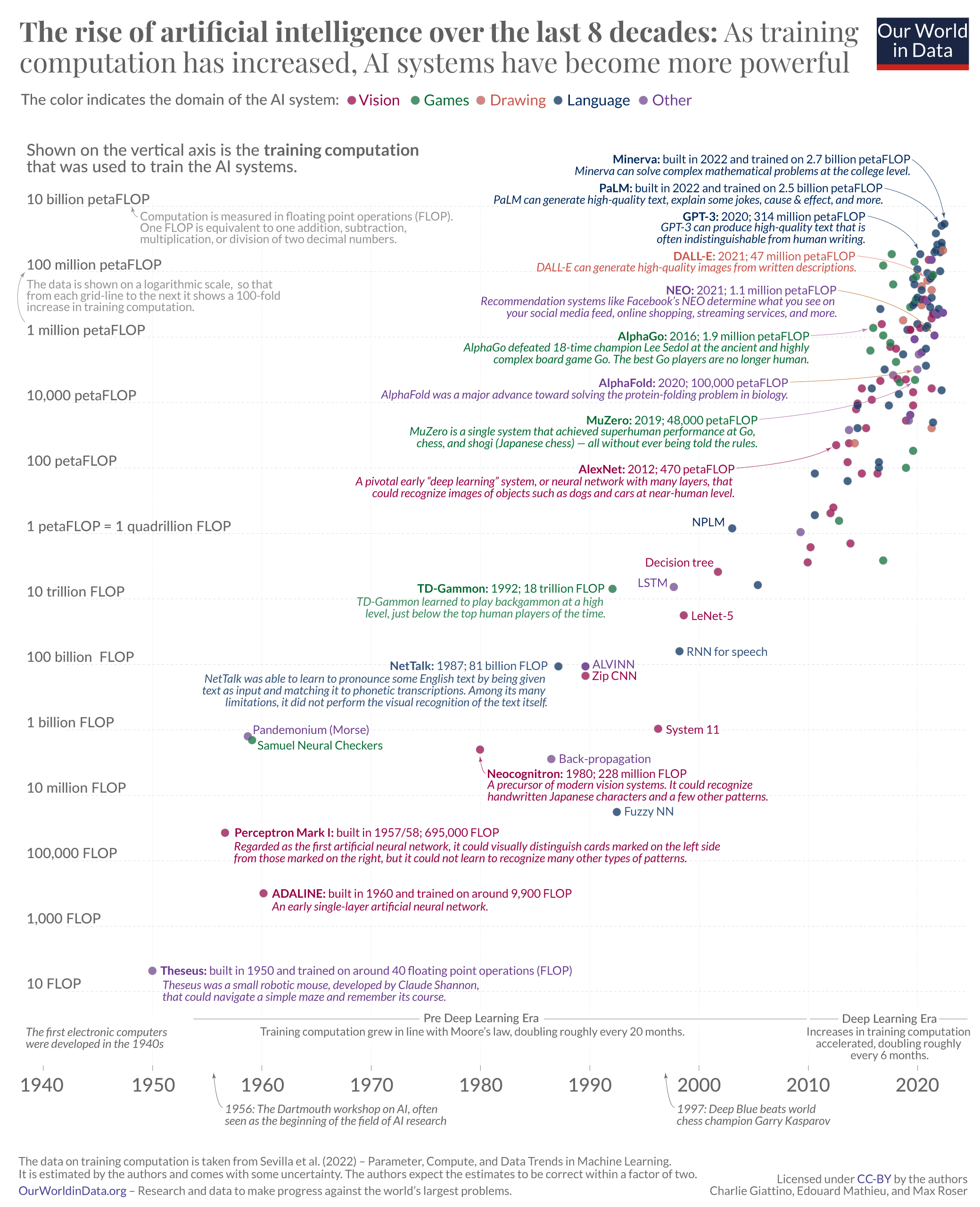
Reproduction of the Our World in Data Plot on the Rise of AI over 8 decades
Introduction
This project uses {plotnine} to reproduce my {ggplot2} version of The rise of artificial intelligence over the last 8 decades (Roser 2022) plot by Our World in Data. The plot has some slight differences based on the data used in my version vs the original.
The original plot is licensed under CC-BY by the authors Charlie Giattino, Edouard Mathieu, and Max Roser. This project is licensed under the same.
The data is taken from (Sevilla et al. 2022) – Compute Trends Across Three eras of Machine Learning. Published in arXiv on March 9, 2022. The data are freely available to the public. Note that the available data to the public continues to be updated.
The original plot has fewer data points, likely due to additions by the data authors after the original article’s release.
Challenges
tl;dr
I had not used {plotnine} before, and my Python familiarity is adequate at best. Beyond this inherent difficulty, here are a few observations I made about {plotnine}:
- There are some clearly missing components from {ggplot2}, due to {plotnine} being built using {matplotlib} as an underlying framework.
coord_polaris currently not available (GitHub Issue) - I didn’t need this, but I had several other plot ideas that weren’t possible.geom_curveis currently not available (GitHub Issue)- It seems impossible to include {ggtext} capabilities (GitHub Issue)
unitis not possible given the current backend (GitHub Issue)geom_segmentdoesn’t seem to work the same as in {ggplot2}: if thesizevalue was too small, it looks like a"dotted"line type reverted to solid. Maybe this is just due to size differences between the parameters in {plotnine} vs {ggplot2}- Note that function names are different - e.g., {ggplot2}:
theme(axis.text.y = …)vs. {plotnine}:theme(axis_text_y = …). This was cumbersome at first…
- The documentation is not clear in several instances
- Adding
ha = "right"for text alignment wasn’t clear to me until I found it randomly while searching for something else. (e.g.,plotnine.annotate) - There are great examples in
geoms_*(e.g.,plotnine.geom_segment), but none in several othergeoms_*(e.g.,plotnine.geom_errorbar) - I realize that this is a primary goal of the {plotnine} competition.
- Adding
- There are several differences between {plotnine} and {ggplot2}, which is understandable, but some are a little confusing - e.g., using
ha = "right"inplotnine.annotatebut not inplotnine.themeelements.- I could not see how to make
plot_marginwork like it does in {ggplot2}. It seems like maybe throughplot_margin_*options, but I wasn’t patient enough to try this… - I also could not figure out how to make major and minor grid line changes like through
panel_grid_minor_x, so I ended up giving up and drawing them as individualplotnine.geom_segments. This was not ideal, but it worked. - I lastly could not get
axis_ticksto work at all, probably because oftheme_voidbut I’m not certain. I had to create tick marks throughgeom_segmentinstead.
- I could not see how to make
- I don’t like how Python code is typically styled, so I added spacing around operators and styled code as if it were in R. In particular, I line broke the plot code a lot, so the code is longer, but more readable (e.g., shorter lines of code)
Load required packages
Dataset Setup
# Load data
data = pd.read_csv("data/trendsInLLMs.csv")

# Clean column names
data = clean_columns(data)

# Select desired columns
data = data[['system', 'publication_date', 'training_compute_flop', 'domain']]

# Drop rows with missing values
data.dropna(inplace=True)

# Convert 'training_compute_flop' to numeric
data['training_compute_flop'] = pd.to_numeric(data['training_compute_flop'], errors='coerce')

# Convert 'publication_date' to datetime to handle dates
data['publication_date'] = pd.to_datetime(data['publication_date'], errors='coerce')
data['publication_date'] = data['publication_date'].apply(lambda x: x if x <= datetime.today() else x.replace(year = x.year - 100))

# Handle the 'domain' column mapping and reordering
domain_mapping = {
    'Vision': 'Vision', 'Games': 'Games', 'Drawing': 'Drawing', 'Language': 'Language',
    'Speech': 'Language'
}
data['domain'] = data['domain'].map(lambda x: domain_mapping.get(x, 'Other'))
data['domain'] = pd.Categorical(data['domain'], categories = ["Vision", "Games", "Drawing", "Language", "Other"], ordered = True)
Metadata
After the wrangling from above, here is the metadata:
| column | dtype | description |
|---|---|---|
system |
object |
The AI system in question |
publication_date |
datetime64[ns] |
Year-Month-Day for when the AI system was published |
training_compute_flop |
float64 |
Total amount of floating point operations used to train the model |
domain |
category |
Vision, speech, language, games, etc |
Examine data
| system | publication_date | training_compute_flop | domain | |
|---|---|---|---|---|
| 1 | Falcon 180B | 2023-09-06 | 3.780000e+24 | Language |
| 2 | Swift | 2023-08-30 | 5.340000e+16 | Other |
| 3 | Jais | 2023-08-29 | 3.080000e+22 | Language |
| 6 | Llama 2 | 2023-07-18 | 9.000000e+23 | Language |
| 7 | Claude 2 | 2023-07-11 | 3.300000e+25 | Language |
<class 'pandas.core.frame.DataFrame'>
Index: 186 entries, 1 to 556
Data columns (total 4 columns):
 #   Column                 Non-Null Count  Dtype
---  ------                 --------------  -----
 0   system                 186 non-null    object
 1   publication_date       186 non-null    datetime64[ns]
 2   training_compute_flop  186 non-null    float64
 3   domain                 186 non-null    category
dtypes: category(1), datetime64[ns](1), float64(1), object(1)
memory usage: 6.2+ KB| publication_date | training_compute_flop | |
|---|---|---|
| count | 186 | 1.860000e+02 |
| mean | 2015-08-08 10:19:21.290322688 | 4.342449e+23 |
| min | 1950-07-02 00:00:00 | 4.000000e+01 |
| 25% | 2015-07-06 00:00:00 | 1.395000e+18 |
| 50% | 2019-10-23 00:00:00 | 8.460000e+20 |
| 75% | 2021-07-27 00:00:00 | 3.245000e+22 |
| max | 2023-09-06 00:00:00 | 3.300000e+25 |
| std | NaN | 2.924188e+24 |
Insights from the data
- Dates range from 1950-07-02 to 2023-09-06
- Minimum value for
training_compute_flopis 40, maximum value is 3.3e+25 - 186 observations (systems) with 0 missing values
Reproduced plot & code
Show the code
# Calculate y-axis breaks (log scale)
limits = (10, 1.e+27)
breaks_vals = breaks_log(14)(limits)
# Define y-axis labels
labels_vals = ["10 FLOP", "1,000 FLOP", "100,000 FLOP", "10 million FLOP",
"1 billion FLOP", "100 billion FLOP", "10 trillion FLOP",
"1 petaFLOP = 1 quadrillion FLOP", "100 petaFLOP",
"10,000 petaFLOP", "1 million petaFLOP",
"100 million petaFLOP", "10 billion petaFLOP",
"Training computation that was used\nto train the AI systems."]
# Define plot
plot = (
ggplot(
data, # Target data
aes(
x = 'publication_date', # x-axis
y = 'training_compute_flop' # y-axis
)
) +
# Begins segments to build x-axis grid lines
geom_segment(
aes(
x = datetime(1940, 1, 1),
xend = datetime(1940, 1, 1),
y = 0.1,
yend = 1e+25
),
size = 0.1,
linetype = "dotted",
color = "#eaeaea"
) +
geom_segment(
aes(
x = datetime(1950, 1, 1),
xend = datetime(1950, 1, 1),
y = 0.1,
yend = 1e+25
),
size = 0.1,
linetype = "dotted",
color = "#eaeaea"
) +
geom_segment(
aes(
x = datetime(1960, 1, 1),
xend = datetime(1960, 1, 1),
y = 0.1,
yend = 1e+25
),
size = 0.1,
linetype = "dotted",
color = "#eaeaea"
) +
geom_segment(
aes(
x = datetime(1970, 1, 1),
xend = datetime(1970, 1, 1),
y = 0.1,
yend = 1e+25
),
size = 0.1,
linetype = "dotted",
color = "#eaeaea"
) +
geom_segment(
aes(
x = datetime(1980, 1, 1),
xend = datetime(1980, 1, 1),
y = 0.1,
yend = 1e+25
),
size = 0.1,
linetype = "dotted",
color = "#eaeaea"
) +
geom_segment(
aes(
x = datetime(1990, 1, 1),
xend = datetime(1990, 1, 1),
y = 0.1,
yend = 1e+25
),
size = 0.1,
linetype = "dotted",
color = "#eaeaea"
) +
geom_segment(
aes(
x = datetime(2000, 1, 1),
xend = datetime(2000, 1, 1),
y = 0.1,
yend = 1e+25
),
size = 0.1,
linetype = "dotted",
color = "#eaeaea"
) +
geom_segment(
aes(
x = datetime(2010, 1, 1),
xend = datetime(2010, 1, 1),
y = 0.1,
yend = 1e+25
),
size = 0.1,
linetype = "dotted",
color = "#eaeaea"
) +
geom_segment(
aes(
x = datetime(2020, 1, 1),
xend = datetime(2020, 1, 1),
y = 0.1,
yend = 1e+25
),
size = 0.1,
linetype = "dotted",
color = "#eaeaea"
) +
# Begins segments to build y-axis grid lines
geom_segment(
aes(
x = datetime(1940, 1, 1),
xend = datetime(2025, 1, 1),
y = 6,
yend = 6
),
size = 0.1,
linetype = "dotted",
color = "#eaeaea"
) +
geom_segment(
aes(
x = datetime(1940, 1, 1),
xend = datetime(2025, 1, 1),
y = 6e+2,
yend = 6e+2
),
size = 0.1,
linetype = "dotted",
color = "#eaeaea"
) +
geom_segment(
aes(
x = datetime(1940, 1, 1),
xend = datetime(2025, 1, 1),
y = 6e+4,
yend = 6e+4
),
size = 0.1,
linetype = "dotted",
color = "#eaeaea"
) +
geom_segment(
aes(
x = datetime(1940, 1, 1),
xend = datetime(2025, 1, 1),
y = 6e+6,
yend = 6e+6
),
size = 0.1,
linetype = "dotted",
color = "#eaeaea"
) +
geom_segment(
aes(
x = datetime(1940, 1, 1),
xend = datetime(2025, 1, 1),
y = 6e+8,
yend = 6e+8
),
size = 0.1,
linetype = "dotted",
color = "#eaeaea"
) +
geom_segment(
aes(
x = datetime(1940, 1, 1),
xend = datetime(2025, 1, 1),
y = 6e+10,
yend = 6e+10
),
size = 0.1,
linetype = "dotted",
color = "#eaeaea"
) +
geom_segment(
aes(
x = datetime(1940, 1, 1),
xend = datetime(2025, 1, 1),
y = 6e+12,
yend = 6e+12
),
size = 0.1,
linetype = "dotted",
color = "#eaeaea"
) +
geom_segment(
aes(
x = datetime(1940, 1, 1),
xend = datetime(2025, 1, 1),
y = 6e+14,
yend = 6e+14
),
size = 0.1,
linetype = "dotted",
color = "#eaeaea"
) +
geom_segment(
aes(
x = datetime(1940, 1, 1),
xend = datetime(2025, 1, 1),
y = 6e+16,
yend = 6e+16
),
size = 0.1,
linetype = "dotted",
color = "#eaeaea"
) +
geom_segment(
aes(
x = datetime(1940, 1, 1),
xend = datetime(2025, 1, 1),
y = 6e+18,
yend = 6e+18
),
size = 0.1,
linetype = "dotted",
color = "#eaeaea"
) +
geom_segment(
aes(
x = datetime(1940, 1, 1),
xend = datetime(2025, 1, 1),
y = 6e+20,
yend = 6e+20
),
size = 0.1,
linetype = "dotted",
color = "#eaeaea"
) +
geom_segment(
aes(
x = datetime(1940, 1, 1),
xend = datetime(2025, 1, 1),
y = 6e+22,
yend = 6e+22
),
size = 0.1,
linetype = "dotted",
color = "#eaeaea"
) +
geom_segment(
aes(
x = datetime(1940, 1, 1),
xend = datetime(2025, 1, 1),
y = 6e+24,
yend = 6e+24
),
size = 0.1,
linetype = "dotted",
color = "#eaeaea"
) +
# Line segment for timeline annotations
geom_segment(
aes(
x = datetime(1953, 1, 1),
xend = datetime(2025, 1, 1),
y = 3.5,
yend = 3.5
),
size = 0.1,
linetype = "solid",
color = "#666666"
) +
# Scatterplot
geom_point(
aes(
color = 'domain'
),
size = 2.5,
alpha = 0.75
) +
# Begin arrow line segments
geom_segment(
aes(
x = datetime(1980, 4, 1),
xend = datetime(1980, 4, 1),
y = 1.75e+07,
yend = 1.5e+08
),
arrow = arrow(
angle = 30,
length = 0.025,
type = "closed"
),
color = "#B4477A",
size = 0.25,
lineend = "butt"
) +
geom_segment(
aes(
x = datetime(2003, 7, 15),
xend = datetime(2012, 2, 27),
y = 5e+16,
yend = 4.5e+17
),
arrow = arrow(
angle = 30,
length = 0.025,
type = "closed"
),
color = "#B4477A",
size = 0.25,
lineend = "butt"
) +
geom_segment(
aes(
x = datetime(2006, 6, 15),
xend = datetime(2019, 6, 19),
y = 1.2e+18,
yend = 4e+19
),
arrow = arrow(
angle = 30,
length = 0.025,
type = "closed"
),
color = "#4B946C",
size = 0.25,
lineend = "butt"
) +
geom_segment(
aes(
x = datetime(2009, 6, 15),
xend = datetime(2019, 7, 15),
y = 1.5e+19,
yend = 9e+19
),
arrow = arrow(
angle = 30,
length = 0.025,
type = "closed"
),
color = "#9674B0",
size = 0.25,
lineend = "butt"
) +
geom_segment(
aes(
x = datetime(2009, 6, 15),
xend = datetime(2015, 6, 27),
y = 4.5e+20,
yend = 1.33e+21
),
arrow = arrow(
angle = 30,
length = 0.025,
type = "closed"
),
color = "#4B946C",
size = 0.25,
lineend = "butt"
) +
geom_segment(
aes(
x = datetime(2010, 2, 15),
xend = datetime(2021, 3, 21),
y = 1.5e+22,
yend = 7.90e+21
),
arrow = arrow(
angle = 30,
length = 0.025,
type = "closed"
),
color = "#476589",
size = 0.25,
lineend = "butt"
) +
geom_segment(
aes(
x = datetime(2011, 3, 15),
xend = datetime(2021, 1, 5),
y = 1.5e+23,
yend = 4.7e+22
),
arrow = arrow(
angle = 30,
length = 0.025,
type = "closed"
),
color = "#D8847C",
size = 0.25,
lineend = "butt"
) +
geom_segment(
aes(
x = datetime(2012, 6, 15),
xend = datetime(2020, 1, 28),
y = 2.5e+24,
yend = 4e+23
),
arrow = arrow(
angle = 30,
length = 0.025,
type = "closed"
),
color = "#476589",
size = 0.25,
lineend = "butt"
) +
geom_segment(
aes(
x = datetime(2014, 12, 15),
xend = datetime(2021, 6, 4),
y = 3e+25,
yend = 3e+24
),
arrow = arrow(
angle = 30,
length = 0.025,
type = "closed"
),
color = "#476589",
size = 0.25,
lineend = "butt"
) +
geom_segment(
aes(
x = datetime(2016, 12, 15),
xend = datetime(2021, 12, 4),
y = 3e+26,
yend = 5e+24
),
arrow = arrow(
angle = 30,
length = 0.025,
type = "closed"
),
color = "#476589",
size = 0.25,
lineend = "butt"
) +
# Begin annotations for desired points
annotate(
geom = "label",
x = datetime(1951, 6, 5),
y = 40,
label = "Theseus: built in 1950 and trained on around 40 floating point operations (FLOP)\nTheseus was a small robotic mouse, developed by Claude Shannon,\nthat could navigate a simple maze and remember its course.",
size = 8,
color = "#9674B0",
label_size = 0,
ha = "left"
) +
annotate(
geom = "label",
x = datetime(1961, 6, 1),
y = 9900,
label = "ADALINE: built in 1960 and trained on aroiund 9,900 FLOP\nAn early single-layer artificial neural network.",
size = 8,
color = "#B4477A",
label_size = 0,
ha = "left"
) +
annotate(
geom = "label",
x = datetime(1957, 12, 1),
y = 125000,
label = "Perceptron Mark I: built in 1957/58, 695,000 FLOP\nRegarded as the first artificial neural network, it could visually distinguish cards marked on the left side\nfrom those marked on the right, but it could not learn to recognize many other patterns.",
size = 8,
color = "#B4477A",
label_size = 0,
ha = "left"
) +
annotate(
geom = "label",
x = datetime(1996, 9, 1),
y = 1400000000,
label = "Fuzzy NN",
size = 8,
color = "#476589",
label_size = 0
) +
annotate(
geom = "label",
x = datetime(1980, 4, 1),
y = 1e+07,
label = "Neocognitron: built in 1980, 228 million FLOP\nA precursor of modern vision systems. It could recognize\nhandwritten Japanese characters and a few other patterns.",
size = 8,
color = "#B4477A",
label_size = 0
) +
annotate(
geom = "label",
x = datetime(1959, 2, 1),
y = 1.6e+09,
label = "Pandemonium (morse)",
size = 8,
color = "#9674B0",
label_size = 0
) +
annotate(
geom = "label",
x = datetime(1959, 10, 1),
y = 1.33e+08,
label = "Samuel Neural Checkers",
size = 8,
color = "#4B946C",
label_size = 0
) +
annotate(
geom = "label",
x = datetime(1986, 6, 6),
y = 3.25e+10,
label = "NetTalk: 1987; 81 billion FLOP\nNetTalk was able to learn to pronounce some English text by given\ntext as input and matching it to phonetic transcriptions. Among its many\nlimitations, it did not perform the visual recognition of the text itself.",
size = 8,
color = "#476589",
label_size = 0,
ha = "right"
) +
annotate(
geom = "label",
x = datetime(1990, 1, 1),
y = 2.15e+11,
label = "ALVINN",
size = 8,
color = "#9674B0",
label_size = 0
) +
annotate(
geom = "label",
x = datetime(1993, 8, 1),
y = 4.34e+10,
label = "Zip CNN",
size = 8,
color = "#B4477A",
label_size = 0
) +
annotate(
geom = "label",
x = datetime(2000, 8, 18),
y = 1.29e+10,
label = "System 11",
size = 8,
color = "#B4477A",
label_size = 0
) +
annotate(
geom = "label",
x = datetime(1986, 8, 18),
y = 3.24e+08,
label = "Back-propagation",
size = 8,
color = "#9674B0",
label_size = 0
) +
annotate(
geom = "label",
x = datetime(1993, 6, 1),
y = 1.2e+08,
label = "Innervator",
size = 8,
color = "#9674B0",
label_size = 0
) +
annotate(
geom = "label",
x = datetime(2004, 6, 1),
y = 2.27e+11,
label = "RNN for speech",
size = 8,
color = "#476589",
label_size = 0
) +
annotate(
geom = "label",
x = datetime(1991, 1, 1),
y = 1.82e+13,
label = "TD-Gammon: 1992; 18 trillion FLOP\nTD-Gammon learned to play backgammon at a high\nlevel, just below the top human players of the time.",
size = 8,
color = "#4B946C",
label_size = 0,
ha = "right"
) +
annotate(
geom = "label",
x = datetime(2002, 6, 1),
y = 2.81e+12,
label = "LeNet-5",
size = 8,
color = "#B4477A",
label_size = 0
) +
annotate(
geom = "label",
x = datetime(2000, 11, 1),
y = 2.10e+13,
label = "LSTM",
size = 8,
color = "#476589",
label_size = 0
) +
annotate(
geom = "label",
x = datetime(2001, 12, 8),
y = 1.75e+14,
label = "Decision tree",
size = 8,
color = "#B4477A",
label_size = 0,
ha = "right"
) +
annotate(
geom = "label",
x = datetime(2002, 1, 1),
y = 1.3e+15,
label = "NPLM",
size = 8,
color = "#476589",
label_size = 0,
ha = "right"
) +
annotate(
geom = "label",
x = datetime(2003, 7, 15),
y = 2e+16,
label = "AlexNet: 2012; 470 petaFLOP\nA pivotal early deep learning system, or neural network with many layers, that\ncould recognize images of objects such as dogs and cars at near-human level.",
size = 8,
color = "#B4477A",
label_size = 0,
ha = "right"
) +
annotate(
geom = "label",
x = datetime(2006, 1, 11),
y = 9e+17,
label = "MuZero: 2019; 48,000 petaFLOP\nMuZero is a single system that achieved superhuman performance at Go\nchess, and shogi (Japanese chess) - all without ever being told the rules.",
size = 8,
color = "#4B946C",
label_size = 0,
ha = "right"
) +
annotate(
geom = "label",
x = datetime(2009, 6, 15),
y = 2e+19,
label = "AlphaFold: 2020; 100,000 petaFLOP\nAlphaFold was a major advance toward solving the protein-folding problem in biology.",
size = 8,
color = "#9674B0",
label_size = 0,
ha = "right"
) +
annotate(
geom = "label",
x = datetime(2009, 6, 15),
y = 3e+20,
label = "AlphaGo: 2016; 1.9 million petaFLOP\nAlphaGo defeated 18-time champion Lee Sedol at the ancient and highly\ncomplex board game Go. The best Go players are no longer human.",
size = 8,
color = "#4B946C",
label_size = 0,
ha = "right"
) +
annotate(
geom = "label",
x = datetime(2010, 6, 15),
y = 9e+21,
label = "NEO: 2021; 1.1 million petaFLOP\nRecommendation systems like Facebook's NEO determine what you see on\nyour social media feed, online shopping, streaming services, and more.",
size = 8,
color = "#476589",
label_size = 0,
ha = "right"
) +
annotate(
geom = "label",
x = datetime(2011, 6, 15),
y = 2e+23,
label = "DALL-E: 2021; 47 million petaFLOP\nDALL-E can generate high-quality images from writteen descriptions.",
size = 8,
color = "#D8847C",
label_size = 0,
ha = "right"
) +
annotate(
geom = "label",
x = datetime(2012, 6, 15),
y = 3e+24,
label = "GPT-3: 2021; 314 million petaFLOP\nGPT-3 can produce high-quality text that is\noften indistinguishable from human writing.",
size = 8,
color = "#476589",
label_size = 0,
ha = "right"
) +
annotate(
geom = "label",
x = datetime(2014, 12, 15),
y = 5e+25,
label = "PaLM: 2022; built in 2022 and trained on 2.5 petaFLOP\nPaLM can generate high-quality text, explain some jokes, cause & effect, and more.",
size = 8,
color = "#476589",
label_size = 0,
ha = "right"
) +
annotate(
geom = "label",
x = datetime(2016, 12, 15),
y = 5e+26,
label = "Minerva: 2022; built in 2022 and trained on 2.7 petaFLOP\nMinerva can solve complex mathematical problems at the college level.",
size = 8,
color = "#476589",
label_size = 0,
ha = "right"
) +
# Begins timeline annotations above the x-axis
annotate(
geom = "label",
x = datetime(1940, 1, 1),
y = 3.5,
label = "Information Age Begins",
size = 9.5,
color = "#666666",
label_size = 0,
ha = "left"
) +
annotate(
geom = "label",
x = datetime(1940, 1, 1),
y = 0.75,
label = "The first electronic computers\nwere developed in the 1940s",
size = 8,
color = "#666666",
label_size = 0,
ha = "left"
) +
annotate(
geom = "label",
x = datetime(1980, 1, 1),
y = 3.5,
label = "Pre Deep Learning Era",
size = 9.5,
color = "#666666",
label_size = 0
) +
annotate(
geom = "label",
x = datetime(1980, 1, 1),
y = 0.75,
label = "Training computation grew in line with\nMoore's law, doubling every 20 months",
size = 8,
color = "#666666",
label_size = 0
) +
annotate(
geom = "label",
x = datetime(2018, 1, 1),
y = 3.5,
label = "Deep Learning Era",
size = 9.5,
color = "#666666",
label_size = 0
) +
annotate(
geom = "label",
x = datetime(2025, 1, 1),
y = 0.75,
label = "Increases in training computation accelerated,\ndoubling roughly every 6 months",
size = 8,
color = "#666666",
label_size = 0,
ha = "right"
) +
# Scale the y-axis as logarithmic
scale_y_log10(
breaks = breaks_vals,
labels = labels_vals
) +
# Manually assign colors to Domain categories
scale_color_manual(
values = ["#B4477A", "#4B946C", "#D8847C", "#476589", "#9674B0"],
labels = ["Vision", "Games", "Drawing", "Language", "Other"]
) +
# Scale the x-axis as datatime
scale_x_datetime(
date_breaks = "10 years",
date_labels = "%Y"
) +
# Set titles within the plot
labs(
title = "The rise of artificial intelligence over the last 8 decades: As training\ncomputation has increased, AI systems have become more powerful",
subtitle = "Computation is measured in floating point operators (FLOP). One FLOP is equivalent to one addition,\nsubtraction, multiplication, or division of two decimals. The data is shown on a logarithmic scale:\neach grid line is a 100-fold increase in computation.",
caption = "Data: Sevilla et al. (2022) | Visual: Greg Chism | Original: OurWorldInData.org - Charlie Giattino, Edouard Mathieu, and Max Roser\nLicensed under CC-BY | #plotnine",
x = None,
y = None,
color = "The color indicates the domain of the AI system:"
) +
# Set base theme void
theme_void(
base_family = "Lato"
) +
# Manually set individual theme elements
theme(
# Plot title
plot_title = element_text(
size = 17.5,
family = "Playfair Display",
hjust = 0
),
# Plot subtitle
plot_subtitle = element_text(
color = "#666666",
hjust = 0,
linespacing = 1.25
),
# Plot caption
plot_caption = element_text(
color = "#666666",
size = 8,
hjust = 0,
linespacing = 1.25
),
# Legend position
legend_position = "top",
# Legend title
legend_title = element_text(
size = 10,
color = "#666666",
hjust = 1
),
# Legend text
legend_text = element_text(
size = 10,
color = "#666666"
),
# x-axis text
axis_text_x = element_text(
size = 12,
color = "#666666",
vjust = 0
),
# y-axis text
axis_text_y = element_text(
size = 12,
color = "#666666",
linespacing = 1.25
),
# Figure size
figure_size = (10, 11)
)
)
# Show the plot
ggplot.show(plot) - 1
- Where the segment begins on the x-axis (datetime)
- 2
- Where the segment ends on the x-axis (datetime)
- 3
- Where the segment begins on the y-axis (log-scale)
- 4
- Where the segment ends on the y-axis (log-scale)
- 5
- Line thickness (size)
- 6
- Line type (dotted)
- 7
- Line color (#eaeaea)
- 8
- Color points by the domain of the AI system
- 9
- Make the point size 2.5
- 10
- Make the alpha (transparency) 0.75 to better view overlap
- 11
- Make the line segment end in an arrow
- 12
- Angle of the arrow (30-degrees)
- 13
- length of the arrow head (0.025)
- 14
- Type of arrow (“closed”)
- 15
- Type of line segment end (“butt”) - see here
- 16
- Set geom type as “label”
- 17
- Where the annotation is on the x-axis (datetime)
- 18
- Where the annotation is on the y-axis (datetime)
- 19
- The label to be printed
- 20
- The (text) size of the annotation
- 21
- The (text) color of the annotation
- 22
- The border line size of the label (reduced to 0)
- 23
- The horizontal justification of the label (left-aligned)
- 24
- Log breaks defined above
- 25
- Labels for each break defined above
- 26
- Manually defined colors
- 27
- Order of labels
- 28
- Set axis breaks to every 10-years
- 29
- Set the lable to years only
- 30
- Set plot title
- 31
- Set plot subtitle
- 32
- Set plot caption
- 33
- No x-axis title
- 34
- No y-axis title
- 35
- Set color legend title
- 36
- Set the base font family to Lato (imported above)
- 37
- Plot title font size
- 38
- Plot title font family as Playfair Display (imported above)
- 39
- Plot title horizontal justification
- 40
- Plot subtitle text color
- 41
- Plot subtitle horizontal justification
- 42
- Plot subtitle line spacing
- 43
- Plot caption text color
- 44
- Plot caption font size
- 45
- Plot caption horizontal justification
- 46
- Plot caption line spacing
- 47
- Legend position to “top”
- 48
- Set legend title font size
- 49
- Set legend title text color
- 50
- Set legend title horizontal
- 51
- Set legend text font size
- 52
- Set legend element text color
- 53
- Set x-axis text font size
- 54
- Set x-axis text color
- 55
- Set x-axis text vertical justification
- 56
- Set y-axis text font size
- 57
- Set y-axis text color
- 58
- Set y-axis line spacing
- 59
- Set to 10 x 11in


Amendments
I had to make some changes from the original. Some changes were design choices to help reduce clutter. Others were to add additional clarity.
- I could not reproduce the axes annotations without literally drawing the entire axis as an annotation (like I did through {ggplot2}. The information is helpful, but also clutters the axis a little too much.
- The caption was reduced to save space. Having technically two captions wouldn’t have been possible anyway.
- I added a subtitle to summarise the y-axis annotation information. I think this is helpful.
- I chose to keep the standard axes text that you can create instead of adding each as an annotation. This better showcases what {plotnine} is capable of by default (e.g.,
plotnine.theme_void). - I removed the x-axis tick marks to simplify the plot a little. This could have only been done with
geom_segment. - I added an annotation where Information Age Begins in 1940. This makes sense, and only really wouldn’t work if the plot was more cluttered (like in the original).
Conclusions
Overall, I found that {plotnine} is not a perfect facsimile of {ggplot2} due to it being built upon the {matplotlib} framework, but its pretty close:
- Most of the functionality from my {ggplot2} version was translatable, with some exceptions (see above).
- The “heart” of {ggplot2} seems to be in {plotnine}, making it a good way for R users to get into plotting through Python.
- All-in-all, I think the plot I produced was pretty similar, so clearly the {plotnine} developers did a great job with the package.
This all being said, I found that working with {plotnine} felt like I was going to break it with every new line. The package feels a little fragile due to this. Some of this however is from my lack of experience in Python.
References
Roser, Max. 2022. “The Brief History of Artificial Intelligence: The World Has Changed Fast — What Might Be Next?” Our World in Data.
Sevilla, Jaime, Lennart Heim, Anson Ho, Tamay Besiroglu, Marius Hobbhahn, and Pablo Villalobos. 2022. “Compute Trends Across Three Eras of Machine Learning.” https://doi.org/10.48550/ARXIV.2202.05924.